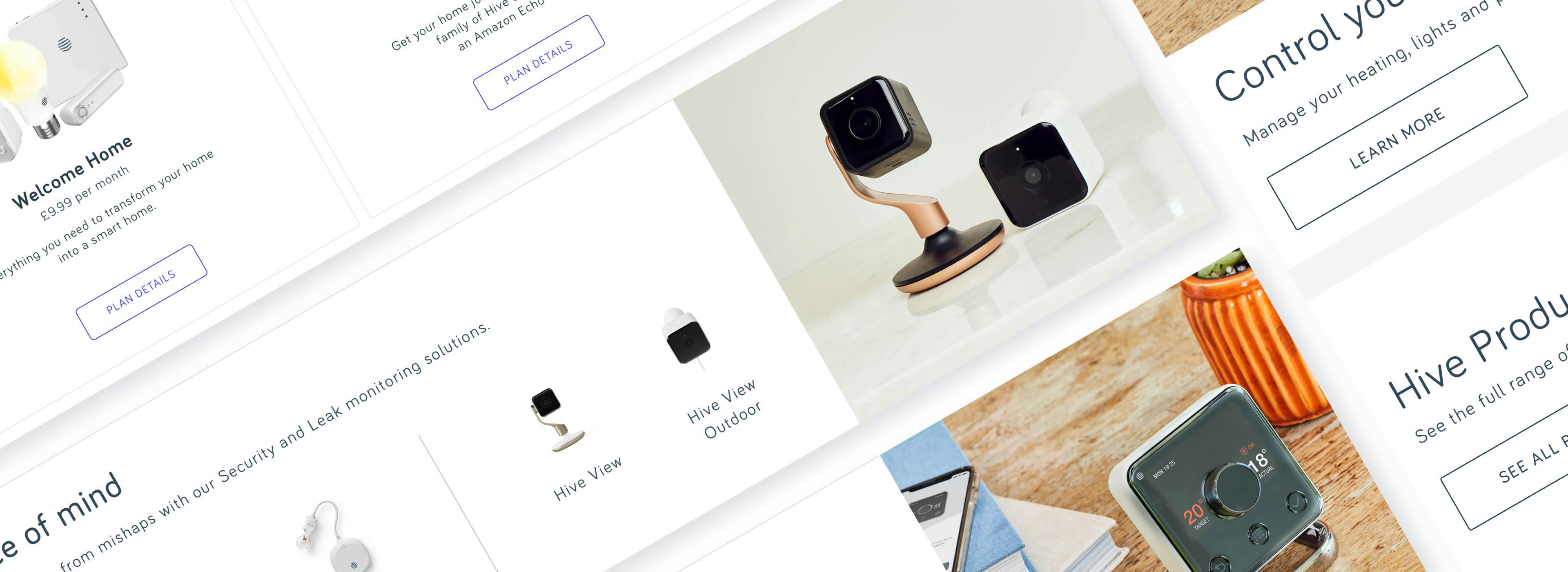
Hive is a trademark owned by Centrica Hive Limited that produces smart home devices. It is also UK’s leading smart-home platform and an e-commerce store for smart-home equipment. It serves ca. 1.2m users.
Using the Hive app and website, customers can control a range of internet-connected devices, from a thermostat to lights, smart plugs, motion sensors, window and door sensors and electric vehicles chargers.
I’ve joined Hive as a Product Design Lead, but shortly after that my responsibilities were also extended to people management. On top of the platform growth and improvements / new features and products I was also responsible for building a team of Product Designers, Researchers and also UI/Visual Designers for marketing purposes (I’ve recruited 5 Product Designers, 2 Researchers and 2 Visual Designers).
I had to revisit the working methodologies, establish ways of working both for the newly-created department and the team within the wider organisation (Product Engineering, Proposition and Marketing teams). The tam was following a double diamond model and was working in Scrum. Later we moved more towards Lean UX approach - continues improvements and fast delivery.
As the department we were responsible for variety of tasks such as introducing new products, revisiting the information architecture, continues optimisation or building a design system.
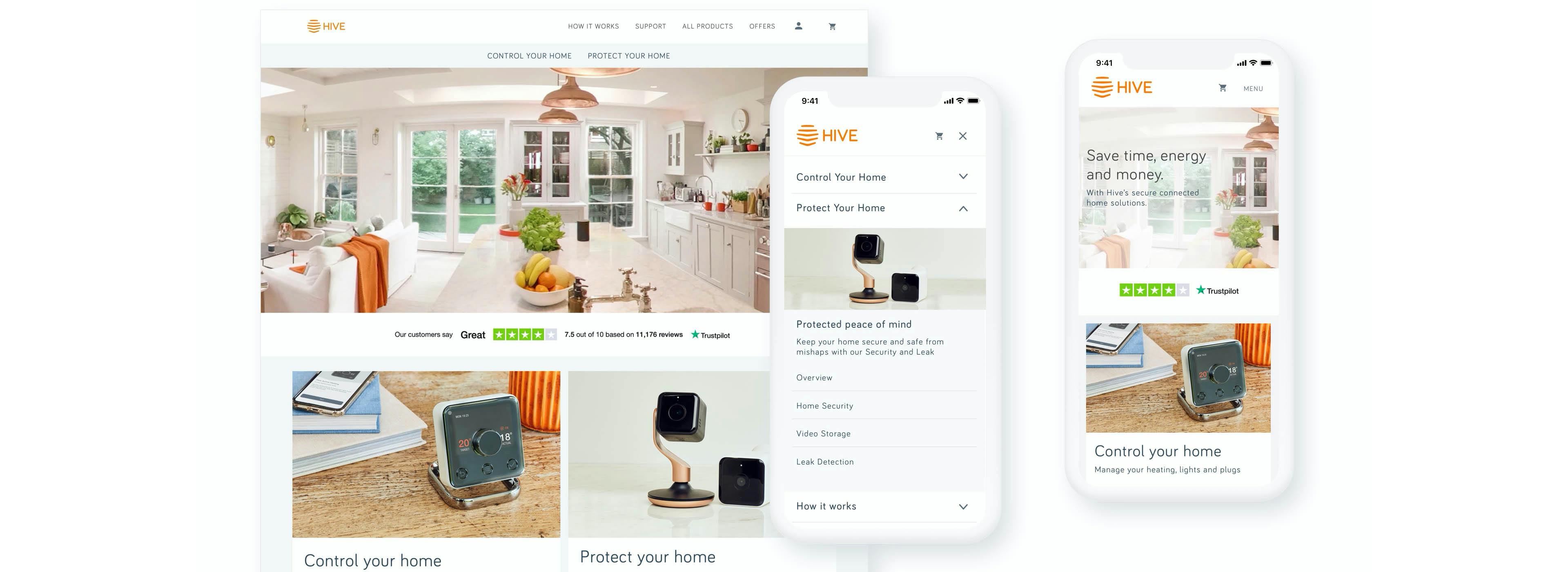
Based on the analysis of application usage data and interviews with stakeholders we've identified that customers find it very difficult to understand the difference between various propositions: Single products, Bundles and Services. The whole architecture was very fragmented and confusing which resulted in a pretty high level of drop-offs in certain areas of the site. Two areas for improvement in information architecture and design have been identified:
Discoverability
supporting new and inexperienced users who had not been incentivised enough to learn about the platform’s offering and finding what is the best solution for their needs.
Findability
continue to offer a quick path to purchase for users with a clear intention to buy. The project was formulated to research and deliver the solution to address the needs of both inexperienced and experienced users.
The project was formulated to research and deliver the solution to address the needs of both inexperienced and experienced users. Additionally, the project had to be completed within 6 weeks and involved the cooperation between internal and external UX teams.
The work was divided into three phases: research and ideation, design, validation and refinement.
During the research and ideation phase, an in-depth analysis of challenges was carried out and initial concepts created. Based on an initial hypothesis a pool of possible concepts was proposed, and three became working concepts.
In the design phase, in order to speed up the hypothesis testing, a rapid evaluation technique called guerilla interviews were used. Guerilla interviews with users allowed to gain user insights about the three proposed hypotheses/navigation concepts.
Subsequently, the concepts were refined and further discovery interviews were carried out. Conclusions were reached about home-page hierarchy, simplification of product categories and redesign of wizard module.
Based on those conclusions, concepts were further narrowed-down and clickable prototypes created. The various prototypes were lab tested with users.
Further validation and user test were carried out during the validation and refinement phase, and final information architecture proposed.
we've experienced a high drop off rate and substandard page to basket rates.
While product pages were attractively designed, we've identified a few major problems with the user experience.
A single product page consisted of many sections – easily seen, yet inadequate, information about the products; confusing customisation options; and a complex upsell section. The amount of content was so overwhelming that it was identified as a source of problems for shoppers.
The initial steps in the project were user labs, testing of the existing pages, and identifying key pain points and issues. We've also worked with the client’s data team by going through the statistics and live sessions recordings. To confirm and improve our design decisions, 3 waves of user labs were run.
As a result, we've added more information about the products, focusing on use cases and key benefits. To make the users’ life easier, a sub-navigation with 3 different sections were added, which helped spread the content and make it easier to understand and navigate.
On one of the sub-pages, we've introduced a new system of customisation and removed the upsell section from this step.
we've had a major problem to solve: the sales were not performing well. While customers were adding a lot of products to the basket, they were leaving the page before completing the purchase. We needed to understand why and fix the issue.
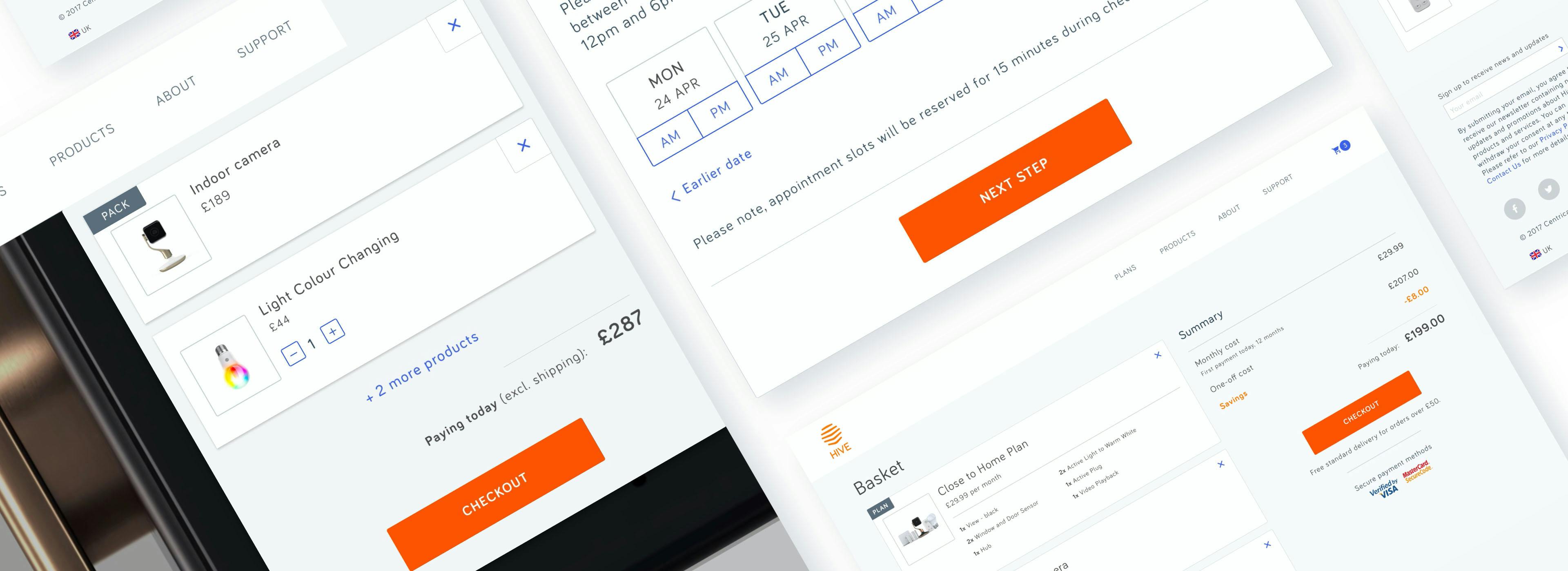
After initial analysis we focused on the performance of the sales funnel and identified a list of significant issues with the checkout journey. We found huge drop-offs in most of the steps, peaking at 70% between the basket and the first step of checkout. Mobile and tablet performances were even worse. The platform had never prioritised mobile traffic, although the vast majority of visitors were smartphone users.
Due to time constraints, we had to start improvements straight from the UI screens. We based our hypotheses on an internal review, discussions with key stakeholders, and many sessions on the data platform. The first design proposals were tested on three waves of user labs with 24 participants going through numerous iterations over six weeks.
Based on conclusions from testing and feedback from user sessions, we've decided to completely redesign all the sections of the store starting from the basket page. We've introduced a clear split between the products and the product summary sections and modelled a clear step-by-step process. We've also removed a "wall of death" – the "create your account/sign in" screen that caused a 70% drop off.
Before the final release, we've ran an A/B tests against the old version of checkout funnel.
Design inconsistency is a common problem, especially in complex global applications with responsive design. We struggled with the lack of consistent visual language which caused a sense of confusion among the users, who perceived the application as lacking polish and regularity. Our first challenge was to improve customer experience. The other one - to change the way designers and developers work together and build a seamless development environment.
The initial research and review showed there was a lot of content across the application. Multiple UI solutions were often associated with the same action and many different designs were used for the one component. Inconsistent use of typography and colours made it very difficult for users to navigate through the application.
We took a modular approach to design the components and made them easily scalable and reusable depending on the hierarchy of the content. We've set the rules for all main features of design such as the use of colours, typography, signifiers, interactions and animations addressing all breakpoints. Because of the presence in 7 different markets and use of 4 languages, we've also ensured support for all the language versions.